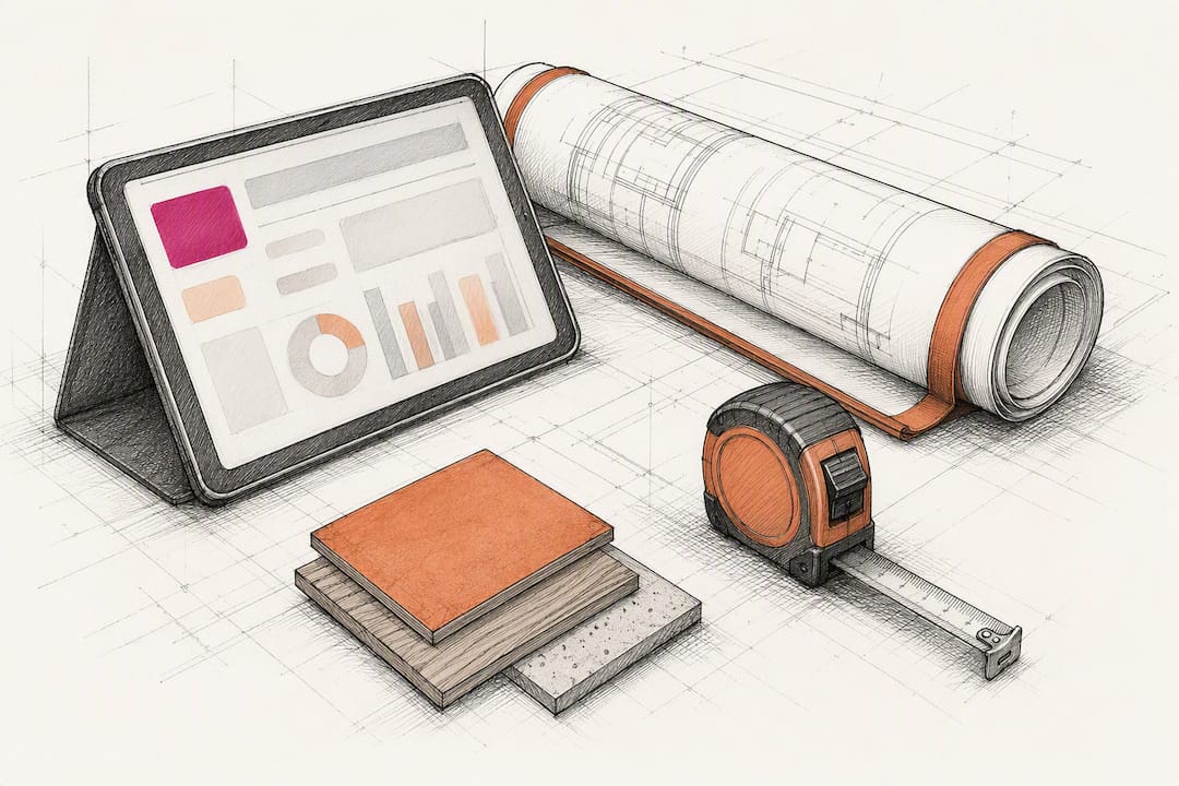
Pilot Construction Dashboards This Week for PMs (Excel, Power BI, CRM)
Start with three dashboards: a single-project KPI view, a job-cost financial dashboard, and an executive portfolio view. Together they cover most decisions a construction team makes on any given week. Build them in Excel or Google Sheets if you need something live by Friday, or in Power BI if you want automatic refreshes tied to your schedule and BIM data. The rest of this guide gives you the layouts, the build steps, and the checks that keep any of these from becoming another report nobody trusts.
TL;DR:
- Use a single project dashboard to monitor schedule variance, open RFIs, safety incidents, and milestone progress at a daily or bi-weekly refresh rate.
- Focus on leading indicators such as schedule compression and predicted completion dates, rather than relying solely on lagging metrics like percent complete or cost to date.
- Standardize data sources and formats before building dashboards to prevent errors and ensure real-time accuracy; connect systems like ERP, scheduling, and safety logs.
- Build audience-specific views with clear thresholds, and pilot dashboards on one project to gather feedback before wider deployment.
- Prioritize schedule quality and avoid data silos to improve dashboard trustworthiness and decision-making effectiveness.
Table of Contents
- What Kind of Construction Dashboard Do You Actually Need?
- Worked Dashboard Templates You Can Copy This Week
- How to Build a Construction Dashboard Step by Step
- What Most Construction Dashboards Get Wrong
- Why Publisher Experience Matters Here
- Start Small, Then Scale Your Dashboards
- See What Your Dashboards Could Look Like With the Right Data Behind Them
- Sources
What Kind of Construction Dashboard Do You Actually Need?
Not every project needs every dashboard. The trick is matching the view to the decision someone has to make, and to how often they need to make it.
A project dashboard tracks a single job day to day. It belongs on a site super’s tablet or a PM’s second monitor, refreshed daily or every few days. The KPIs that matter here: schedule variance, percent complete versus planned, open RFIs, outstanding submittals, and safety incidents logged that week.
A schedule dashboard zooms in on the critical path. It shows float remaining, tasks behind baseline, and upcoming milestones at risk. Superintendents and schedulers check this one constantly, often daily during crunch phases.
A job-cost or financial dashboard answers the money question: are we going to make budget? It shows committed costs versus actual spend versus forecast, plus change orders pending approval and cash flow projections. Project accountants and PMs review it weekly, and it’s usually the centerpiece of the Monday budget meeting.
A safety dashboard tracks incident rates, near-misses, and inspection compliance across a site or portfolio. Safety managers and superintendents watch it weekly, though it gets pulled up immediately after any incident.
A productivity dashboard measures labor hours against units installed, crew efficiency by trade, and equipment utilization. Field supervisors and operations managers use this to catch productivity drops before they compound.
A subcontractor dashboard rolls up performance across trades: on-time delivery, quality callbacks, and responsiveness to RFIs.
A portfolio or executive dashboard rolls all of the above up across every active job. Executives use it monthly, sometimes biweekly, to spot which projects need attention before a small problem becomes a write-off.
Worked Dashboard Templates You Can Copy This Week
Here’s what each of the three core dashboards should look like once it’s built, along with the format trade-offs that determine how fast you can get one running.
-
Single-project KPI dashboard. Top row: four or five metric cards showing budget variance, schedule variance, percent complete, and open safety incidents. Middle section: a schedule versus actual bar chart plotted against baseline dates. Bottom half: a budget variance table by cost code, an open-issues list (RFIs, submittals, punch items), and a short list of milestones due in the next two weeks.
-
Job-cost financial dashboard. A three-column comparison table running committed cost, actual cost, and forecast cost by budget line. Below it, a cash flow forecast chart projecting the next 60 to 90 days. A change order tracker sits alongside, flagging anything pending owner approval past a set number of days.
-
Executive portfolio view. A ranked list or slide showing every active project with a red/yellow/green flag for schedule health, a margin-at-risk indicator, and predicted completion date versus contract date. This is the one format where a slide deck (PowerPoint or Google Slides) often beats a live dashboard, since executives frequently want a static snapshot they can annotate in a meeting rather than a tool they log into.
On format: spreadsheets in Excel or Google Sheets win on setup speed. You can have a working template in an afternoon, and smaller contractors commonly start here before graduating to anything more complex. Power BI or Tableau win on refreshability and interactivity, especially once you connect a scheduling tool or ERP system directly. A customized Power BI dashboard tied to BIM and Primavera data can update automatically as schedules change, which a static spreadsheet never will.
Pro Tip: Before you touch any template, standardize your column naming and date formats across every data source. Nothing kills a dashboard build faster than discovering your schedule tool uses MM/DD/YYYY and your job-cost export uses DD/MM/YYYY.
How to Build a Construction Dashboard Step by Step
Templates get you started. This sequence is what turns a template into something your team actually trusts and uses.
-
Validate your schedule and job-cost data first. Check logic ties, predecessor relationships, and constrained dates in your schedule before you build anything on top of it. A dashboard built on a broken schedule just displays the problem faster.
-
Wireframe the layout and agree on thresholds before building. Sketch the dashboard on paper or in a slide, and get stakeholders to agree what counts as “at risk” or “on track” before you write a single formula. Practitioner guidance on dashboard design consistently flags this as the step teams skip, and the step that causes the most rework later.
-
Pick a compact set of KPIs, including leading indicators. Don’t try to display 40 metrics. Include predicted completion date and schedule compression alongside percent complete, since compression reveals risk that percent-complete alone tends to miss.
-
Connect your data sources and set a refresh cadence. Map out timekeeping, your ERP or job-cost system, your scheduling tool, and safety logs. Decide upfront whether this updates daily, weekly, or on manual pull, and stick to it.
-
Build audience-specific views with clear drill paths. A superintendent needs different depth than a CFO. Document every metric definition so two people never argue about what “percent complete” means.
-
Pilot it, collect feedback, and iterate. Run it on one live project for a few weeks before rolling it out portfolio-wide.
Pro Tip: Assign one person as the owner of each metric’s definition. When a number gets questioned in a meeting, that person answers, rather than the dashboard itself becoming the argument.
What Most Construction Dashboards Get Wrong
Schedule quality is the prerequisite nobody wants to deal with, but skipping it is the single most common failure point. Before trusting any dashboard, run a quick screen: are there open-ended activities without successors, tasks with hard constraint dates that override logic, and negative float anywhere in the network? If yes to any of these, fix the schedule before you build the dashboard.
Most dashboards also lean too hard on lagging metrics: percent complete, cost to date, incidents logged. Effective dashboards surface leading signals instead, tracking SPI trend over time, schedule compression, and predicted completion rather than a single-period snapshot.
Other recurring failures and their fixes:
- Data silos. Fix it by pulling from one source of truth per metric, not three spreadsheets that disagree.
- Too much detail for executives. Fix it by capping the portfolio view at five to eight metrics per project.
- Stale refresh cycles. Fix it by stating the refresh cadence directly on the dashboard.
- Undefined thresholds. Fix it by documenting what red, yellow, and green actually mean before launch.
In tested field deployments, dashboards designed with clear interfaces and current data scored above 85 on usefulness measures for scheduling and decision-making, which tells you the ceiling is real when governance is in place.
Why Publisher Experience Matters Here
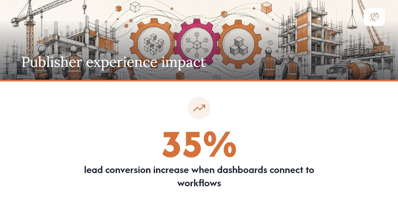
The platform combines automated lead tracking, workflow automation, and custom reporting dashboards designed specifically for contractors, suppliers, manufacturers, and consultants rather than a generic sales team. Some users report lead conversion increases of 35% after connecting dashboard visibility to their sales and project workflows. That kind of outcome depends on clean, connected data behind the dashboard, not just a well-designed screen.
Start Small, Then Scale Your Dashboards
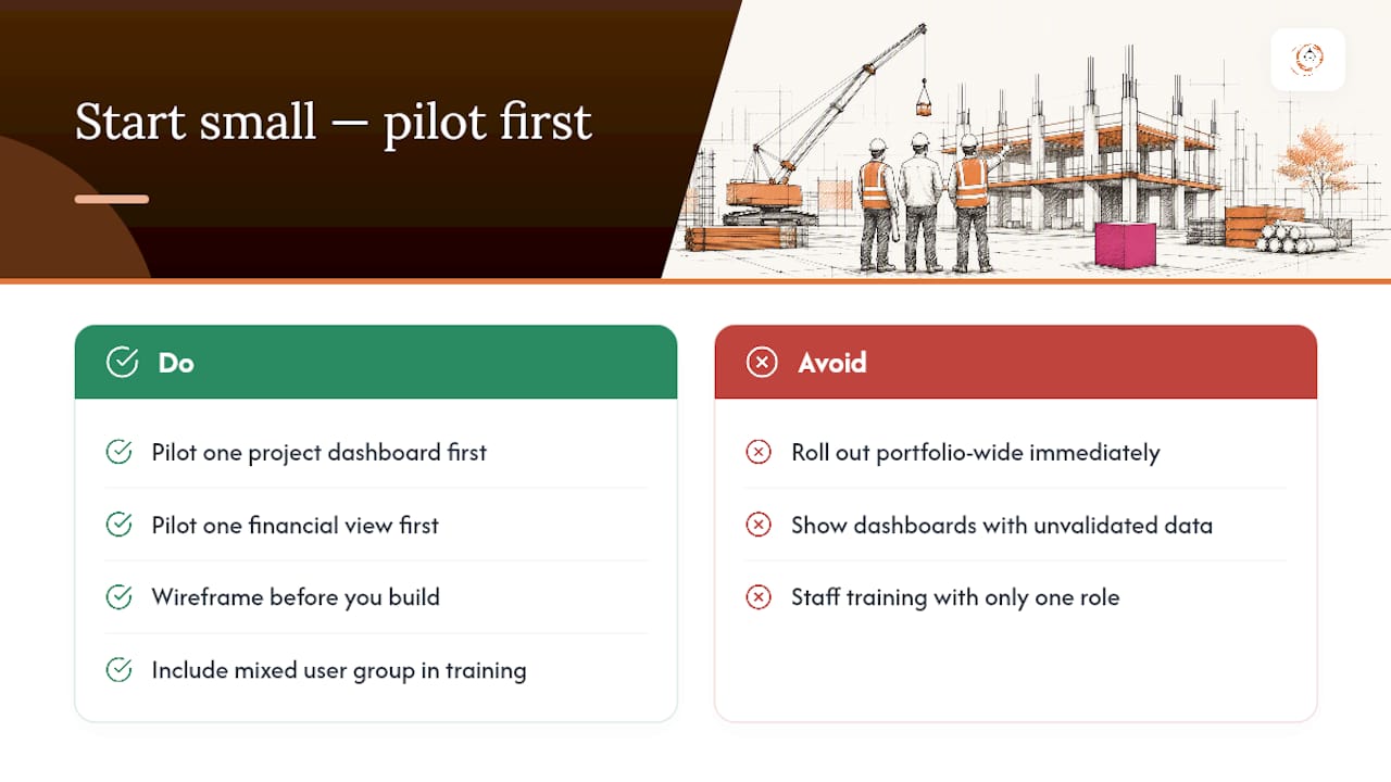
If you take one thing from this guide, take this: pilot one project dashboard and one financial view before you ever attempt a portfolio rollout. Teams that jump straight to executive dashboards usually end up debugging bad data in front of leadership, which is the worst possible place to discover it.
Wireframe first. Agree on thresholds before you build. And when you’re staffing the pilot team or shooting training materials, put a genuinely mixed group of contractors, supervisors, and office staff in front of the camera. Construction is not one demographic, and your dashboard training shouldn’t look like it is.
— Rowena
See What Your Dashboards Could Look Like With the Right Data Behind Them
Every template in this guide works better when the numbers feeding it come from one connected system instead of three disconnected spreadsheets. The solution pairs construction CRM workflows, automated lead tracking, and custom reporting dashboards so your job-cost, schedule, and pipeline data live in one place instead of a dozen exports.
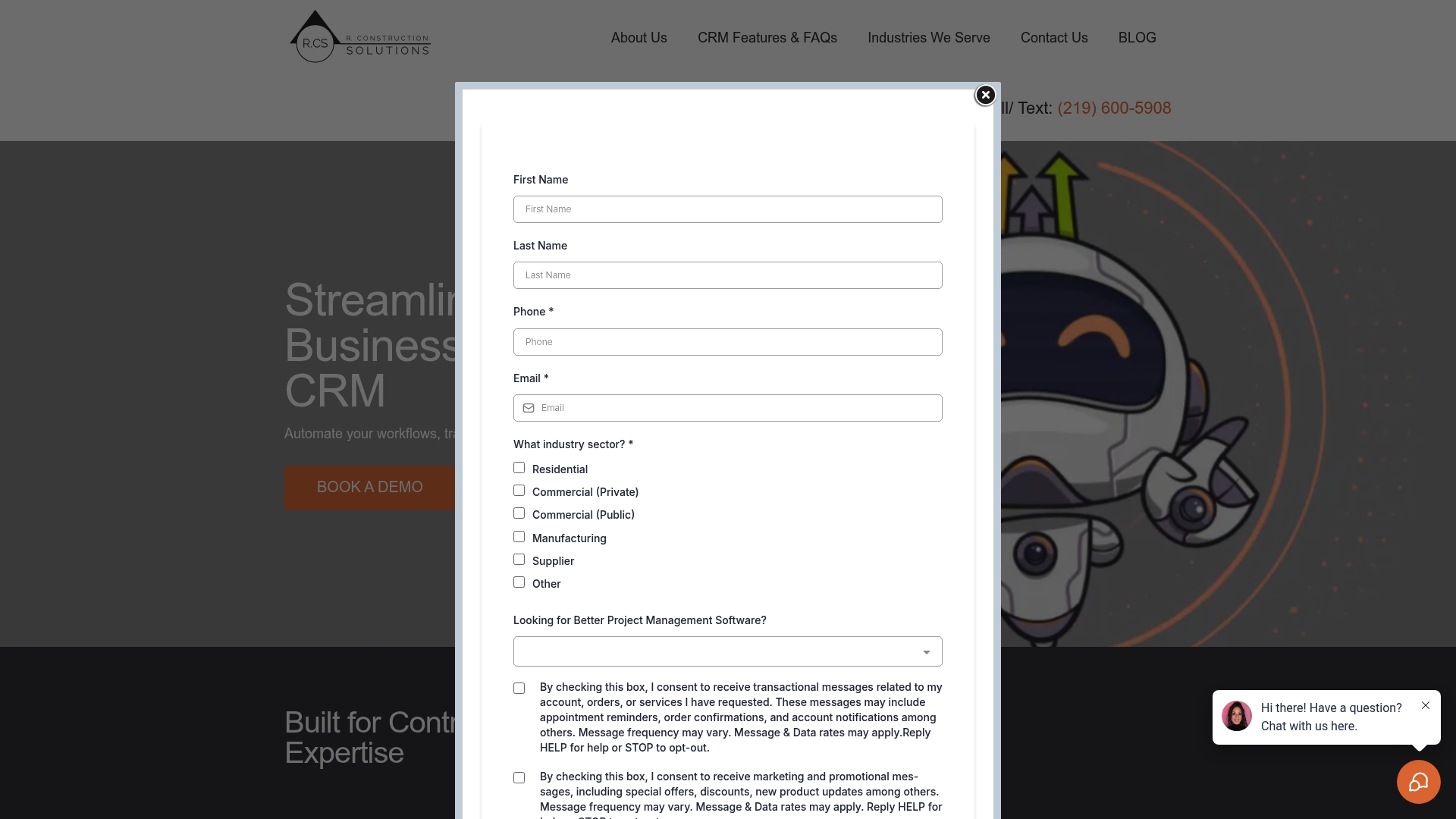
Rather than building a dashboard on top of data you have to chase down every week, you get reporting tied directly to the workflows already running your bids, subcontractor communication, and project pipeline. If you want to see what that looks like for your trade or business type, visit the industries served by Highlevelcrm-rconstructionsolutions page and book a demo to walk through a pilot dashboard built around your own data.
Sources
For deeper technical detail, see the BI and BIM dashboard research cited above, plus project-controls insights on the Buildberry blog and asset-tracking analysis from Equiptrack.
- What a construction project dashboard should actually show (and what most get wrong)
- Using dashboards to track construction KPIs
Recommended
- Construction CRM Implementation: A Practical Rollout Playbook
- Manual Data Calculations Contractors Should Automate Now
- Commercial Construction Software Comparison Checklist 2026
- Custom Reporting for Contractors: Your 2026 Field Guide
Signed up, or thinking about it? We build the inside of the account — pipelines, workflows, funnels, nurture, migration. Built for construction. Contact us.
Affiliate disclosure. We’re a GoHighLevel affiliate. Sign up through our link and we may earn a commission at no cost to you, or buy direct. Build-out is billed separately, never a software markup.